
Tuesday, March 31, 2009
Sunday, March 29, 2009
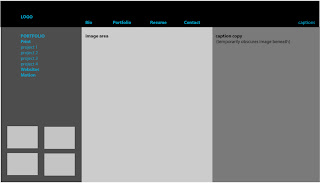
Wireframes
Wireframe # 1 (below):
Based (more or less) on the 12-column, 960px wide format. Navigation in blue.

Wireframe #2 (below):

Wireframe #3 (below):
Based (more or less) on the 12-column, 960px wide format. Navigation in blue.

Wireframe #2 (below):

Wireframe #3 (below):

Wednesday, March 25, 2009
Colors, Typefaces, Logo (Final)


Wednesday, March 11, 2009
Interface & Information Architecture, Part II

Schematic: Defines placement of global elements (repeat on every page in the site), navigation, variable content (i.e. projects) on every page, as defined in the sitemap.
Page size: 800x600 max; 730x400, recommended. A grid determines page layout, so that elements maintain a consistent position.
A portfolio site contains three types of material:
1. Unique page content (images accompanying captions.) When you start to layout the schematic, select your largest image and the longest project description – don’t want to discover halfway through something’s not going to fit in the layout.
2. Navigation (links to main groups; secondary navigation to maneuver around inside a group.) Generally, horizontal navigation works better when there are fewer items to navigate through. Vertical is more efficient when there are more items and their specific numbers vary.
3. Global Information (brand ID; contact information.)
Look and Feel: As the schematic takes shape, we almost inadvertently stumble into a Look and Feel of the site; type size and navigation have already fallen into place, now you just have to keep brand ID (style/theme?) and target audience (considered earlier in this blog) in mind.
Tuesday, March 10, 2009
Project Captions
Print:
Newsletter........................ Project: Nutrition Newsletter
Dimensions: 17”x11”, folds to 8.5”x11”
Objective: 2-color (duotone), 4-page newsletter.
Program: InDesign
Magazine.......................... Project: HOW Magazine
Dimensions: Cover and table of contents, 8.5”x11”; inside spread, 17”v11”, folds to 8.5”x11”
Objective: 4-color, redesign proposal. Graphics and typography to complement/coincide with copy provided.
Program: InDesign
Menu................................ Project: Restaurant Menu
Dimensions: 15”x5”, folding to 5”x5”
Objective: 4-color, menu proposal for Eno Restaurant. Typographical treatment of restaurant’s brand ID (determined by designer) to include logo, photo/illustrations which enhance creative symbolism.
Program: InDesign
Art Book........................... Project: Coffee-table Book
Dimensions: 8.5”x11”
Objective: 4-color, coffee-table book designed around a collection of Playbills and ticket stubs amassed over a period of 40 years.
Program: InDesign
Motion Graphics:
Gunfight........................... Project: Walk Cycle/Time
Dimensions: 550x400px
Objective: 40-60 second animation designed around the concept of time, featuring a walking figure. Audio optional.
Program: Flash
Egypt................................ Project: Slide Show
Dimensions: 800x600px
Objective: Slide show, emphasis on interactivity. Audio optional.
Program: Flash
Casino.............................. Project: Branching Story
Dimensions: 550x400px
Objective: Four possible resolutions to story premise. Emphasis on plot development through animation (over text) and interactivity. Color and design choices contribute to cohesive environment.
Program: Flash
Websites:
Resolution Movie............. Project: Movie Website
Dimensions: 1024x768px
Objective: Collaborative project between filmmakers and website designer to promote the film Resolution – a dark, espionage drama. Develop creative brief, site map, wireframe. Website’s imagery/theme based on Resolution’s premise.
Program: Dreamweaver
St. Andrew’s Church........ Project: Church Website
Dimensions: 1024x768px
Objective: Create an online presence (pro bono) profiling church’s mission and activities.
Program: Dreamweaver
Storytelling Arts............... Project: Storytelling Arts, a non-profit promoting the art of storytelling to teachers and school administrators.
Dimensions: 800x600px
Objective: Website design team worked closely with client to redesign their existing website. Previous website unsatisfactory on many levels – function, content, visual.
As Content Manager for the redesign team, responsibilities included maintaining an accurate inventory of assets (graphics and copy) to be featured on website.
As Production Manager’s Assistant, worked closely with Production Manager – primarily in regard to developing and adjusting production timeline.
Designed and produced (coded) interactive “Storytelling Voices” pages (featured) after coordinating studio time to accommodate storytelling artists and recording professionals.
Program: Dreamweaver
NJ Assoc. of Realtors...........Project: Interactive map [web address]
Dimensions: 800px
Objective: Select, size, crop geographic appropriate images featured on rollover.
Program: Photoshop/Dreamweaver
Monday, March 9, 2009
Interface & Information Architecture, Part I
Group:
My portfolio is not so voluminous that the groups are not self-evident: Print, Websites and Motion Graphics. Mixing my pieces up via other nomenclature would definitely confuse the user.
Site Map:

A site map is a flow chart representing every page in my portfolio. When I arrange my ideas logically, users will not feel lost as they navigate through the digital portfolio site.
Additionally, a site map will help me answer several questions before I start building: 1. Will the user go directly from the homepage to view the work (or will there be a second level of navigation to access each group?); 2. Will all the work in a group be equally available (no hierarchy) or do I want to guide the user’s experience in order to view specific pieces in a specific sequence?
A successful site map shows three things at a glance:
1. Grouping – In may case, Print, Websites and Motion Graphics
2. Hierarchy – Where each page fits within the site
3. Connections – What will link from each page? (Since I plan to create my digital portfolio in Flash, there will be no links to outside sites, yes?)
The site map will account for every page on my digital portfolio site: A homepage from which each group’s page will branch – Portfolio (Print, Websites and Motion Graphics); Global pages (1. Bio; 2. Resume; and 3. Contact) will be accessible from any page.
It’s crucial to keep the concept of modularity in mind when creating the digital portfolio. Can the different pages be easily updated as new projects accrue; will it be easy to delete outdated/second-rate projects? This is particularly important for portfolios created in Flash – group interface elements together in timeline layers; create reusable symbols! If you fail to do this, you won’t be able to add a new link to the main nav bar!
“Schematic” and “Look and Feel” will follow (soon) in Interface & IA, Part II.
My portfolio is not so voluminous that the groups are not self-evident: Print, Websites and Motion Graphics. Mixing my pieces up via other nomenclature would definitely confuse the user.
Site Map:
A site map is a flow chart representing every page in my portfolio. When I arrange my ideas logically, users will not feel lost as they navigate through the digital portfolio site.
Additionally, a site map will help me answer several questions before I start building: 1. Will the user go directly from the homepage to view the work (or will there be a second level of navigation to access each group?); 2. Will all the work in a group be equally available (no hierarchy) or do I want to guide the user’s experience in order to view specific pieces in a specific sequence?
A successful site map shows three things at a glance:
1. Grouping – In may case, Print, Websites and Motion Graphics
2. Hierarchy – Where each page fits within the site
3. Connections – What will link from each page? (Since I plan to create my digital portfolio in Flash, there will be no links to outside sites, yes?)
The site map will account for every page on my digital portfolio site: A homepage from which each group’s page will branch – Portfolio (Print, Websites and Motion Graphics); Global pages (1. Bio; 2. Resume; and 3. Contact) will be accessible from any page.
It’s crucial to keep the concept of modularity in mind when creating the digital portfolio. Can the different pages be easily updated as new projects accrue; will it be easy to delete outdated/second-rate projects? This is particularly important for portfolios created in Flash – group interface elements together in timeline layers; create reusable symbols! If you fail to do this, you won’t be able to add a new link to the main nav bar!
“Schematic” and “Look and Feel” will follow (soon) in Interface & IA, Part II.
Sunday, March 8, 2009
Final Concept Choice, Images
Homepage: closed portfolio, click 'enter'

Portfolio rotates, anticipating opening

Open portfolio displays navs (left), image (right, TBD)

Portfolio rotates, anticipating opening
Open portfolio displays navs (left), image (right, TBD)
"Must Haves" (revised)
Content and Description:
Bio – “Experienced Graphic Designer thrives in deadline-driven environments and working within budget requirements, seeks full-time position. Conceptualizes and produces digital artwork for clients and in-house staff. Creatively translates subject matter into compelling design themes and graphics for marketing and sales presentations. Streamlines production and quality awareness.”
Portfolio –
Print: Nutrition newsletter, Menu, HOW Magazine, Admit One (Art Book)
Website screen captures: Storytelling Arts, Resolution, St. Andrew’s Church, NJ Assoc. Realtors (?)
Motion: Walk Cycle, Branching Story (Casino),
Resume – downloadable PDF, available on request
Captions – project title, dimensions, objective, program
Contact – my email address
Style:
Consistent application of the ‘Portfolio’ metaphor/concept throughout the site
Consistent application of branding concept – my logo, color theme, typography, etc.
Consistent navigation – location, color
Memorable Interactivity – enough to make the site a destination on its own terms, regardless of the content.
Sound – user hears a ‘click’ when selecting navigation elements
Site Map – or not?
Thursday, March 5, 2009
5 Concept Images
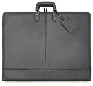
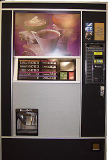
OK... Let's try this again. The following images are digital portfolio concept metaphors, in order of 'like':
1. Traditional Portfolios – It took me awhile to extricate myself from all the student portfolios I had been looking at for the past few months. I had unwittingly brainwashed myself into thinking, “This is what they all look like; I’ll make mine a clone of theirs.” However, after I stepped back for a moment I realized that many of the student (and professional) portfolios I had been looking at didn’t rely on a metaphor (“like something we are familiar with in the real world”); rather, they relied on a conventional website model – one that could just as easily be selling farm equipment as artwork.
So I had myself aV-8 moment and discovered the obvious: Portfolio=Portfolio! Why not use an image of a real portfolio? With a little nip-and-tuck here and there (courtesy of Flash), the concept has the potential to achieve the sophistication I desire while losing the childishness I was so suspicious of in “friendly” digital portfolios.

2. Newsstands – After months of self-evaluation I’ve come to believe my strengths primarily lie in Print – less so in web and motion graphics – so the obvious metaphor would be a newsstand. However, my concern is: how would I develop this as a homepage? I’m sure the potential is there, I just have to think it through.


3. Vending Machines – Well, we’re all familiar with vending machines, whether we care to admit it or not. Since I’m dispensing a ‘product’ to an anonymous (though targeted) ‘consumer’ again, the answer was obvious. And I believe homepage has more development potential than Newsstands, particularly the coffee vending machine (fourth image presented in this series.)


4. Bulletin Boards and 5. Torn Flyers on Kiosks – I’m combining these last two concepts together because they’re both so similar. The metaphor here is obvious: Printed material haphazardly collected together to form a crazy collage. Rollover and click on the link, it’ll take the user to the project. Nothing terribly new here. Furthermore, I’m not overly in love with this concept because haphazard and crazy I’m not. (Though the third one in this group has potential.)


5. Torn Flyers on Kiosks – See caption above.


1. Traditional Portfolios – It took me awhile to extricate myself from all the student portfolios I had been looking at for the past few months. I had unwittingly brainwashed myself into thinking, “This is what they all look like; I’ll make mine a clone of theirs.” However, after I stepped back for a moment I realized that many of the student (and professional) portfolios I had been looking at didn’t rely on a metaphor (“like something we are familiar with in the real world”); rather, they relied on a conventional website model – one that could just as easily be selling farm equipment as artwork.
So I had myself aV-8 moment and discovered the obvious: Portfolio=Portfolio! Why not use an image of a real portfolio? With a little nip-and-tuck here and there (courtesy of Flash), the concept has the potential to achieve the sophistication I desire while losing the childishness I was so suspicious of in “friendly” digital portfolios.
2. Newsstands – After months of self-evaluation I’ve come to believe my strengths primarily lie in Print – less so in web and motion graphics – so the obvious metaphor would be a newsstand. However, my concern is: how would I develop this as a homepage? I’m sure the potential is there, I just have to think it through.
3. Vending Machines – Well, we’re all familiar with vending machines, whether we care to admit it or not. Since I’m dispensing a ‘product’ to an anonymous (though targeted) ‘consumer’ again, the answer was obvious. And I believe homepage has more development potential than Newsstands, particularly the coffee vending machine (fourth image presented in this series.)
4. Bulletin Boards and 5. Torn Flyers on Kiosks – I’m combining these last two concepts together because they’re both so similar. The metaphor here is obvious: Printed material haphazardly collected together to form a crazy collage. Rollover and click on the link, it’ll take the user to the project. Nothing terribly new here. Furthermore, I’m not overly in love with this concept because haphazard and crazy I’m not. (Though the third one in this group has potential.)
5. Torn Flyers on Kiosks – See caption above.
Wednesday, March 4, 2009
5 Concepts for my Portfolio
Concept: 1) A visual way you express how you think about your work; and 2) An idea applied consistently [throughout the digital portfolio] because it fits your work and your site’s architecture.
Style: A collection of attributes that create a surface look (i.e. motion effects or trendy fonts.)
Metaphor: A way of thinking about portfolio structure. A successful metaphor says the portfolio is organized in a certain way, and is like something we are familiar with in the real world; successfully developed, a metaphor helps the viewer understand and interact with your format (UI.)
Online portfolios adhere to at least one of the following metaphors; few are mutually exclusive (as defined in Designing a Digital Portfolio, p 195-198):
That said, the metaphors I’ll be using to control the UX in my portfolio will be that of a magazine (primarily.) There will be a Table of Contents (Bio, Portfolio, Resume, Contact.) The Portfolio section will break down into sub sections: Print, Websites and Motion Graphics. However, the UX will also mimic the real time user experience at a gallery exhibition: all Portfolio work will be captioned along with navigation (in the form of thumbnails at the bottom of the page) allowing the user to slow down, speed up or revisit any pieces in the Portfolio section. Not such a different experience than that of strolling through a series of galleries at a museum where one might linger, revisit or skip work depending on ones interests and time constraints.
For specific examples, see one of the links (below); screen captures/images are inadequate substitutes for website interaction.
http://www.howarddesign.com/
http://adrianpreussdesign.com/wordpress/print/list-1/fng/
http://www.saatchi.com/worldwide/ideas_gallery.asp
I really like Saachi's Ideas Gallery UI.
Style: A collection of attributes that create a surface look (i.e. motion effects or trendy fonts.)
Metaphor: A way of thinking about portfolio structure. A successful metaphor says the portfolio is organized in a certain way, and is like something we are familiar with in the real world; successfully developed, a metaphor helps the viewer understand and interact with your format (UI.)
Online portfolios adhere to at least one of the following metaphors; few are mutually exclusive (as defined in Designing a Digital Portfolio, p 195-198):
- Gallery
- Spec sheet/brochure
- Outreach
- Narrative
- Diary
- Experience
That said, the metaphors I’ll be using to control the UX in my portfolio will be that of a magazine (primarily.) There will be a Table of Contents (Bio, Portfolio, Resume, Contact.) The Portfolio section will break down into sub sections: Print, Websites and Motion Graphics. However, the UX will also mimic the real time user experience at a gallery exhibition: all Portfolio work will be captioned along with navigation (in the form of thumbnails at the bottom of the page) allowing the user to slow down, speed up or revisit any pieces in the Portfolio section. Not such a different experience than that of strolling through a series of galleries at a museum where one might linger, revisit or skip work depending on ones interests and time constraints.
For specific examples, see one of the links (below); screen captures/images are inadequate substitutes for website interaction.
http://www.howarddesign.com/
http://adrianpreussdesign.com/wordpress/print/list-1/fng/
http://www.saatchi.com/worldwide/ideas_gallery.asp
I really like Saachi's Ideas Gallery UI.
Sunday, March 1, 2009
Caption/Process Informs Design Decisions

Project Specs as Defined by Professor at Onset of Project:
“Art Book Design”
Specifications: Based on your personal likes, select a topic with your professor that will give you pleasure in researching and designing. Maybe the book is a special collection you have already: postcards, baseball cards, antiques, etc. Typography can be used to set the visual tone, making the book classic, modern, sophisticated or restrained, etc.
Book dimensions: TBD by designer (student)
Colors: Your choice, b/w or 4-color on specialty papers
Books must include:
- Cover Design
- Title Page
- Dedication Page
- Table of Contents
- Chapter Opener Pages
- Chapter Editorial Spreads
- Author Profile Page
- Back Cover
Binding: TBD by designer (student)
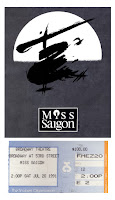
Design Process Comments:Without getting too literal, I knew from the onset that a ticket stub had to be included on the cover (my cover, above left) because ticket stubs were to be an integral design component of the interior page’s layouts. Hoping to take a design cue from typography present on the ticket stubs themselves proved a dead-end. However, the gradient blends appearing on some ticket stubs (see Miss Saigon example, above) proved to be a jumping off point for me – many times, I only need a ‘jumping off’ point and the rest of the project’s design theme takes shape from there, with what seems to be little intervention from me.
My Caption to "Admit One " will Include:
- Project – “Art Book”
- Dimensions – 8.5”x11”
- Objective – A coffee-table book designed around a collection of Playbills and ticket stubs amassed over a period of 40 years
- Program – InDesign
Resume/Logo Version 2.1

Revised resume (per homework assignment.) Of particular note, I changed the font from Rockwell to Verdana (adding a .2 outline stroke of white) in 'Summary' - Rockwell was looking fussy/busy. Still not sure if copy speaks to my target audience or not... so tired of looking at this thing. Like rearranging deck chairs on the Titanic.
Subscribe to:
Posts (Atom)