Sunday, March 8, 2009

Final Concept Choice, Images

Homepage: closed portfolio, click 'enter'

Portfolio rotates, anticipating opening

Open portfolio displays navs (left), image (right, TBD)

"Must Haves" (revised)

Content and Description:
Bio – “Experienced Graphic Designer thrives in deadline-driven environments and working within budget requirements, seeks full-time position. Conceptualizes and produces digital artwork for clients and in-house staff. Creatively translates subject matter into compelling design themes and graphics for marketing and sales presentations. Streamlines production and quality awareness.”
Portfolio –

Print: Nutrition newsletter, Menu, HOW Magazine, Admit One (Art Book)

Website screen captures: Storytelling Arts, Resolution, St. Andrew’s Church, NJ Assoc. Realtors (?)

Motion: Walk Cycle, Branching Story (Casino), Egypt slide show
Resume – downloadable PDF, available on request
Captions – project title, dimensions, objective, program
Contact – my email address

Style:
Consistent application of the ‘Portfolio’ metaphor/concept throughout the site
Consistent application of branding concept – my logo, color theme, typography, etc.
Consistent navigation – location, color
Memorable Interactivity – enough to make the site a destination on its own terms, regardless of the content.
Sound – user hears a ‘click’ when selecting navigation elements
Site Map – or not?

Thursday, March 5, 2009

5 Concept Images

OK... Let's try this again. The following images are digital portfolio concept metaphors, in order of 'like':

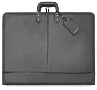
1. Traditional Portfolios – It took me awhile to extricate myself from all the student portfolios I had been looking at for the past few months. I had unwittingly brainwashed myself into thinking, “This is what they all look like; I’ll make mine a clone of theirs.” However, after I stepped back for a moment I realized that many of the student (and professional) portfolios I had been looking at didn’t rely on a metaphor (“like something we are familiar with in the real world”); rather, they relied on a conventional website model – one that could just as easily be selling farm equipment as artwork.
So I had myself aV-8 moment and discovered the obvious: Portfolio=Portfolio! Why not use an image of a real portfolio? With a little nip-and-tuck here and there (courtesy of Flash), the concept has the potential to achieve the sophistication I desire while losing the childishness I was so suspicious of in “friendly” digital portfolios.


2. NewsstandsAfter months of self-evaluation I’ve come to believe my strengths primarily lie in Print – less so in web and motion graphics – so the obvious metaphor would be a newsstand. However, my concern is: how would I develop this as a homepage? I’m sure the potential is there, I just have to think it through.


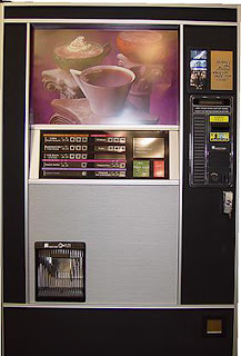
3. Vending Machines – Well, we’re all familiar with vending machines, whether we care to admit it or not. Since I’m dispensing a ‘product’ to an anonymous (though targeted) ‘consumer’ again, the answer was obvious. And I believe homepage has more development potential than Newsstands, particularly the coffee vending machine (fourth image presented in this series.)


4. Bulletin Boards and 5. Torn Flyers on Kiosks I’m combining these last two concepts together because they’re both so similar. The metaphor here is obvious: Printed material haphazardly collected together to form a crazy collage. Rollover and click on the link, it’ll take the user to the project. Nothing terribly new here. Furthermore, I’m not overly in love with this concept because haphazard and crazy I’m not. (Though the third one in this group has potential.)


5. Torn Flyers on Kiosks See caption above.


Wednesday, March 4, 2009

"Must Have" Elements in Digital Portfolio

  • Bio
  • Portfolio
    Print
    Websites
    Motion Graphics
  • Resume
  • Contact

5 Concepts for my Portfolio

Concept: 1) A visual way you express how you think about your work; and 2) An idea applied consistently [throughout the digital portfolio] because it fits your work and your site’s architecture.
Style: A collection of attributes that create a surface look (i.e. motion effects or trendy fonts.)
Metaphor: A way of thinking about portfolio structure. A successful metaphor says the portfolio is organized in a certain way, and is like something we are familiar with in the real world; successfully developed, a metaphor helps the viewer understand and interact with your format (UI.)
Online portfolios adhere to at least one of the following metaphors; few are mutually exclusive (as defined in Designing a Digital Portfolio, p 195-198):
  • Gallery
  • Spec sheet/brochure
  • Outreach
  • Narrative
  • Diary
  • Experience
Based on the definitions of the various digital portfolios listed above, I suspect my portfolio will be a hybrid, exhibiting characteristics of both Outreach and Gallery metaphors. Outreach, because it’s client-centric, anticipating the target audience’s “attention span”. Additionally, the Outreach portfolio metaphor says to the target audience, “This is what I can do for you.” And Gallery, because all of the work featured in my portfolio will bear captions. The Gallery portfolio metaphor says to the target audience, “This is my work. Draw your own conclusions.”
That said, the metaphors I’ll be using to control the UX in my portfolio will be that of a magazine (primarily.) There will be a Table of Contents (Bio, Portfolio, Resume, Contact.) The Portfolio section will break down into sub sections: Print, Websites and Motion Graphics. However, the UX will also mimic the real time user experience at a gallery exhibition: all Portfolio work will be captioned along with navigation (in the form of thumbnails at the bottom of the page) allowing the user to slow down, speed up or revisit any pieces in the Portfolio section. Not such a different experience than that of strolling through a series of galleries at a museum where one might linger, revisit or skip work depending on ones interests and time constraints.
For specific examples, see one of the links (below); screen captures/images are inadequate substitutes for website interaction.
http://www.howarddesign.com/
http://adrianpreussdesign.com/wordpress/print/list-1/fng/
http://www.saatchi.com/worldwide/ideas_gallery.asp
I really like Saachi's Ideas Gallery UI.

Sunday, March 1, 2009

Caption/Process Informs Design Decisions


Project Specs as Defined by Professor at Onset of Project:
“Art Book Design”

Specifications
: Based on your personal likes, select a topic with your professor that will give you pleasure in researching and designing. Maybe the book is a special collection you have already: postcards, baseball cards, antiques, etc. Typography can be used to set the visual tone, making the book classic, modern, sophisticated or restrained, etc.
Book dimensions:
TBD by designer (student)
Colors:
Your choice, b/w or 4-color on specialty papers
Books must include:
  • Cover Design
  • Title Page
  • Dedication Page
  • Table of Contents
  • Chapter Opener Pages
  • Chapter Editorial Spreads
  • Author Profile Page
  • Back Cover

Binding: TBD by designer (student)

Design Process Comments:
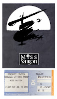
Without getting too literal, I knew from the onset that a ticket stub had to be included on the cover (my cover, above left) because ticket stubs were to be an integral design component of the interior page’s layouts. Hoping to take a design cue from typography present on the ticket stubs themselves proved a dead-end. However, the gradient blends appearing on some ticket stubs (see Miss Saigon example, above) proved to be a jumping off point for me – many times, I only need a ‘jumping off’ point and the rest of the project’s design theme takes shape from there, with what seems to be little intervention from me.

My Caption to "Admit One " will Include:
  1. Project – “Art Book”
  2. Dimensions – 8.5”x11”
  3. Objective – A coffee-table book designed around a collection of Playbills and ticket stubs amassed over a period of 40 years
  4. Program – InDesign

Resume/Logo Version 2.1


Revised resume (per homework assignment.) Of particular note, I changed the font from Rockwell to Verdana (adding a .2 outline stroke of white) in 'Summary' - Rockwell was looking fussy/busy. Still not sure if copy speaks to my target audience or not... so tired of looking at this thing. Like rearranging deck chairs on the Titanic.